Directing CSS Animations
Tips on running a smooth show
This is a growing collection of notes on web animation techniques and performance. I recently took David Khoursid's course on Front End Masters, which encouraged me to go beyond hacky CSS transitions to keyframe-based animations...then to understanding more of how browsers work.
 Welcome to the browser's main stage
– or main thread?
Welcome to the browser's main stage
– or main thread?
Who to move?
For the love of buttery animations, modifying only transform and opacity goes a long way! Animating layout properties (like "top", "left", "margin") costs the browser a big recalculation to render changes. Modifying visual properties (e.g."box-shadow") that trigger repaints can also get expensive.
Transform and opacity animate cheaply because elements with those properties set may have their own ~special~ composition layers that don't need processing by the browser's hectic main thread. Instead, the device's GPU can help handle compositing (more on CSS GPU Animation here).
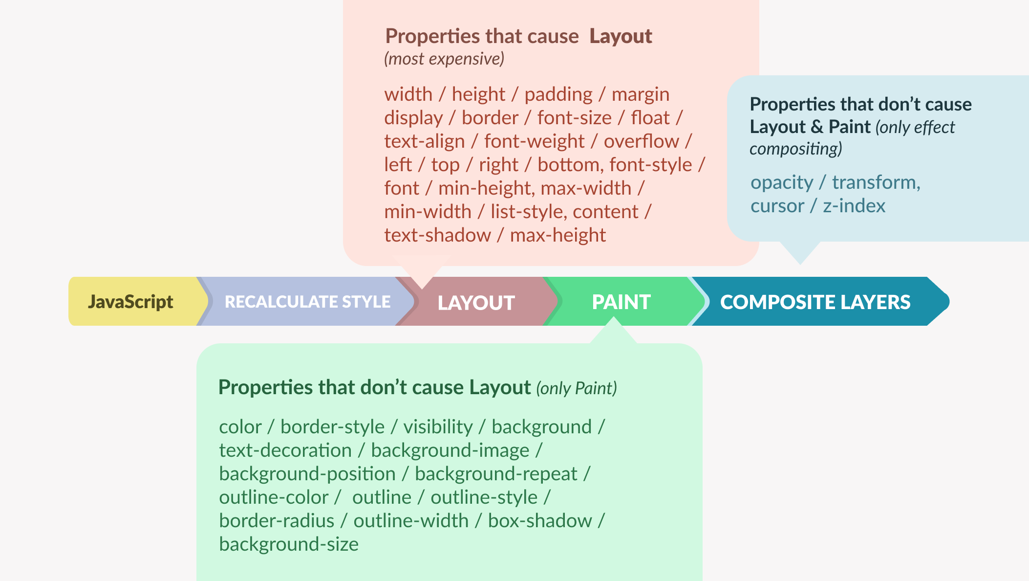 Properties to avoid animating (from
Reza Lavarian's article)
Properties to avoid animating (from
Reza Lavarian's article)
Telling the will-change property which properties will animate can optimize performance even more, but only when used sparingly for when the browser really needs a boost (e.g. for 3D transforms).
Choreographic technique
While Framer Motion can stagger animations in 1 line of code, it's also easy to DIY the effect. And not just by manually setting a "transition-delay" property for each ":nth-of-type()" like so:
.ball {
  animation: whoosh 200ms;
}

.ball:nth-of-type(2) {
  animation-delay: 100ms;
}

.ball:nth-of-type(3) {
  animation-delay: 200ms;
}
Sure, it works in a pinch...but what if there's more elements? To help keep track of everyone on stage, there's a clever way to use CSS variables in the markup:
<div class="ball" style="--i: 0"></div>
<div class="ball" style="--i: 1"></div>
<div class="ball" style="--i: 2"></div>
With CSS variables (animation duration, stagger amount, and intervals between each animation) set up, the "--i" variable is usable for calculating timing.
.ball {
  /* Other styles */
  --duration: 1s;
  --stagger: 0.3s;
  --interval: calc(var(--duration) - var(--stagger));
  animation: move-right var(--duration) calc(var(--interval) * var(--i)) both;
}
Beyond timing, this technique is also useful for positioning repeated elements e.g. calculating rotation angles for items around a circle.
A state of disarray order
Just like how a button can be in different states (e.g. active, disabled), other elements – or the entire app or webpage – can also have states that correspond to different animations. This is where data attributes are handy.
It's possible to reference attributes in CSS like so:
/* Select by the prescence of an attribute or it's value */
[data-active] {}
[data-open="true"] {}

/* BTW, regex-style selectors are available! */
[data-test^="toast"] /* matches anything that starts with "toast" */
[data-test$="toast"] /* ends with "toast", even if "toast" isn't the entire word */
[data-test*="to"] /* contains "to", even if it's not an entire word */
[data-test~="toast"] /* contains the specific word e.g. in an attribute that is a space-separated list of words */
With a bit of Javascript, it becomes easy to coordinate the states:
function setState(state) {
  element.dataset.state = state;

  const active = document.querySelectorAll(`[data-active]`);

  active.forEach((el) => {
    delete el.dataset.active;
  });

  const shown = document.querySelectorAll(`[data-show="${state}"]`);

  shown.forEach((el) => {
    el.dataset.active = true;
  });

  if (state === "subscribing") {
    //mock logic for determining state
    setTimeout(() => {
      if (Math.random() > 0.2) {
        setState("success");
      } else setState("error");
    }, 1000);
  }
}
A workflow tip for viewing and debugging animation states is by using these commands the Dev Tools console:
app.dataset //see the data tags
app.dataset.state = ‘value’ //set state
Playing it back
There's an Animation tab in Chrome Dev Tools (found with "CMD + Shift + P" with dev tools open) that helps with inspecting and modifying animations on a page. It's an amazing utility that can be useful for learning – for example when seeing an interesting effect in the wild and opening the panel to inspect its details in slow motion.
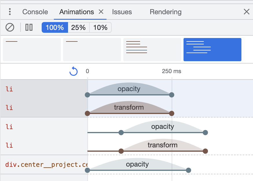 A breakdown of
animations on a page via the Animation panel
A breakdown of
animations on a page via the Animation panel
Areas to dive deeper:
- Learn how to animate SVG
- Experimenting with the Web Animations API to see how it feels compared to CSS Animations
- Trying Houdini to extend CSS and define custom properties